2lch wants to design a book cover I'm interested in illustrating a book cover. Are you a self-publishing author? Contact me if you think we should work together.
2lch wants to work with a florist I'm also interested in working with a florist. Contact me if that's you!

My style, in a few images (full at-a-glance summary available here):

  • The Flingstress || 2lch
  • wishsoup3
  • 2lch || Community Ladders identity
  • tulch-bussolati-hearts-our-clients-promo-packaging-my498-1
  • Not-allowed_evilly-ironic-tulch

Category: layout

Death in the Andres by Mario Vargas Llosa book cover inspiration || 2lch

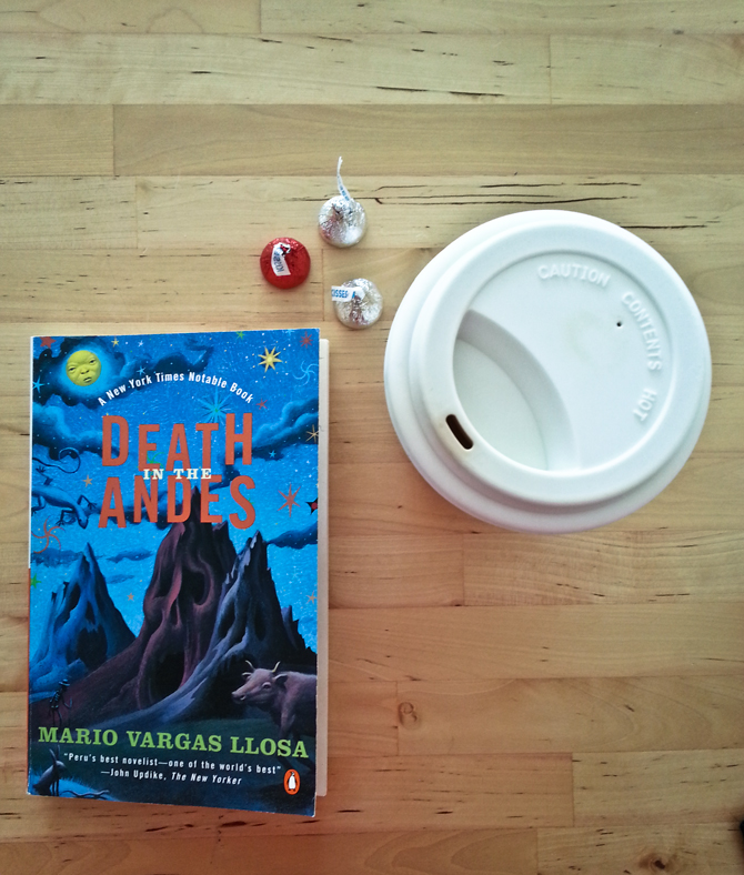
First of all, this is a great piece of fiction.

Mario Vargas LLosa takes you on a whirlwind exploration of a Peruvian clash of old and new, superstitious and productive, magical and violent. I read this book in one sitting.

It’s just a cherry on top that I also really like the cover. It’s strange, because this is not the kind of design I would normally like. Yet of all the editions of this book I’ve seen, this is probably my favorite. The illustration perfectly captures the sense of disturbing whimsy that you feel after you read the story (also, I think the cover of the latest edition is too forward on the disturbing part). Plus, the typography choices in the title really work with the image here. I’m not sure what it is, but something works.

Death in the Andres by Mario Vargas Llosa book cover inspiration || 2lch

The one thing that I’m not a fan of is that when you open the book, it looks as if the cover didn’t exist. There’s a title page with a completely different typographic treatment. And why oh why would anyone have every character in the author’s name in italics except the first letters??! Aye! Look at how foreign those two L’s in “Llosa” look next to each other!

Death in the Andres by Mario Vargas Llosa book cover inspiration || 2lch

2lch || YM Magazine Critique

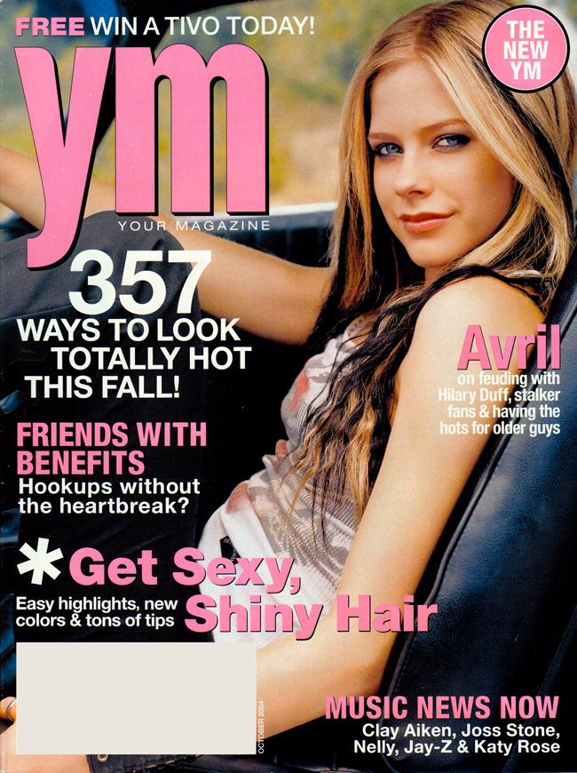
The other day, I started cleaning out the piles of old magazines I’ve accumulated since I was a preteen. I used to love magazines as a medium, and at one point dreamed of being an Editor-in-Chief at some cheeky publication like Radar (which now exists only as RadarOnline.com, a horrifying black hole of pop culture. Back when it was a print magazine, Radar was awarded a General Excellence nomination by the American Society of Magazine Editors and was one of the funniest magazines you could pick up for a casual read, complete with a horoscope section that repeatedly left out Capricorn. I still miss it.). Too bad we’re currently witnessing the death of magazines as a business model…

Anyway, I randomly picked up a dusty 2004 copy of YM magazine and flipped through it to find out what terrible things I chose to read about as a kid. First of all, Avril Lavigne was on the cover. Yup. I learned that she didn’t know who the Pixies were. I also learned that the spread on Joss Stone a few pages later should have really been the cover story, and that I’m now a little bit more in love with Ms. Stone and her appreciation of Motown, Aretha Franklin, Lauryn Hill, Anita Baker, Tracy Chapman, and India.Arie.

However, this post is not meant to be an outlet for my pop rage, so I thought I’d take the time to point out some things that caught my eye in terms of magazine design.

First up, the left side of an opening spread for a quiz. I was very impressed with how spot-on the headline typography was, and how appropriate the choice of a ’20s matchbox-style type and illustration seemed with the content. The color scheme, textures, and general composition feels so, so right. And how great is that detail of folded edge lines?

2lch || YM Magazine Critique

YET. That subhead and byline? I understand that these things are often templated when it comes to typography and colors, but why the horrid position in the layout? Even when you crop out the surrounding visuals, it seems incredibly difficult to read, and in no way fits with the rest of the page.

2lch || YM Magazine Critique

Next, the main fashion spread. First off, I must say that I loved the art direction of the shoot and general composition. Unfortunately, I’m missing random pages of the magazine and can’t figure out who the photographer is, but I want to briefly point out how great it is that in every shot with multiple people, they are on different levels so you never have two sets of eyes on the same visual line.

2lch || YM Magazine Critique

And here’s where I must note that when it comes to fashion spreads, I’m a big fan of minimal captions. There is no need to get crazy in the layout here and introduce elements that compete with photography (which is, by the way, the main selling tool here, not the caption). Also, if you must angle something, it’s often best not to run it parallel to the main compositional angle of the shot. Anyway, I wish all captions were left vertical in this spread.

2lch || YM Magazine Critique

I really liked the treatment of images and pull quotes in an article about female soldiers. I’m generally a fan of bold, dark type juxtapositions with photos, so this works very well, especially for the subject. The leading on the pull quote makes me particularly happy.

2lch || YM Magazine Critique

And finally, although this is not a design note, I love their featured “real girl” and the photo chosen to represent her. If you’re going to show off young women that rock, this is exactly how they should look–happy, strong, and with their hands dirty. You go, Kiki.

2lch || YM Magazine Critique


It’s really interesting to come back to YM as an adult reader (whoa, was the tone in these girls’ magazines condescending at times…) and more so, as an adult designer with magazine experience. Makes me wonder how much design contributed to the magazine’s survival in the marketplace (I don’t consider YM to be one of the stronger examples of design). Apparently, YM was purchased by Conde Nast the same year the above issue came out, and replaced by Teen Vogue. Before the purchase, YM enjoyed a 72-year publication history under several different titles, and is only beat by Seventeen as the oldest-published girls’ magazine. Whether it was due to internal conflicts, a shrinking market, the emergence of stronger competitors, something went wrong and we are now left with a reminder to keep our chins up and emphasize great design in print!

Because I’m a living, breathing human, I love Taylor sandwiches. It’s probably unhealthy how much I love Market Street.

I also love their design, the way the menu looks, the feel of the interior.

Great menu design! // Taylor Gourmet

However…

The kerning is a bit funny // Taylor Gourmet

What’s up with that kerning? (If you need some practice yourself, reader, play)

image

At Bussolati, we work with HSUS’s Animal Sheltering magazine. How cute is their false cover re: subscription renewal??

image

Hello Whole Foods, thanks for the view.

image

Public enemy number 2

Aw. Notice the delicate balance of priority between the dog poop story and the Turkish earthquake story.

image

This is a postcard ad that I picked up in a Moscow hostel over a year ago. Hiiiilarious.