The Red Bandana Bakery is awesome—the goods are delicious, the owner is spirited, and there’s a lot of love and care that goes into every single detail. We worked together to refine the owner’s original logo concept in order to make the various versions of the logo display better across various media, including the storefront, packaging, merchandise,… [Continue Reading]
Acronym logo makeover: SAS Acupuncture
I really love doing makeovers on existing materials. It’s really energizing for both me and the client when I can take something they have already tried and refine it just a bit to help them say exactly what they’ve been trying to say all along with, say, their logo. This was the case with SAS, an acupuncture practice I helped… [Continue Reading]
A Special Sign for A Bridal Shower
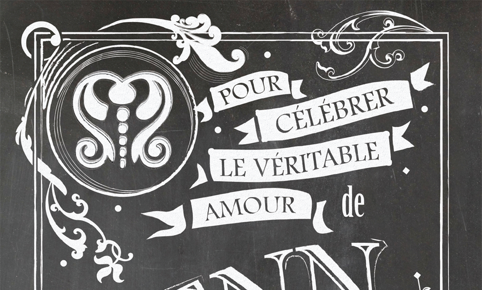
A Maid of Honor looking to make her bride’s Parisian-themed bridal shower extra special approached me for help. She asked if I could make a chalkboard sign for the party that celebrates the special love of the bride and groom. The result is a large poster that the MoH was able to take to her… [Continue Reading]
District Capital Management Identity
District Capital Management is a DC-area team of top-notch investment and financial planning professionals. The team wanted an edgy logo to represent a fresh but reliable approach to investment services, and the identity I created for them is just that—a play on a traditional bull symbol combined with a compass motif, pointing the way to… [Continue Reading]
The Lucubrators blog identity
The Lucubrators is a personal blog I keep with my SO. What a great excuse to play around with hand lettering!