• Skip to primary navigation
  • Skip to main content
  • Skip to primary sidebar
  • Skip to footer

2LCH

A world of purposeful work. ¡Que milagro!

  • Work

Acronym logo makeover: SAS Acupuncture

I really love doing makeovers on existing materials. It’s really energizing for both me and the client when I can take something they have already tried and refine it just a bit to help them say exactly what they’ve been trying to say all along with, say, their logo. This was the case with SAS, an acupuncture practice I helped recently.

Before, SAS was trying to create an elegant, scripted feel with their acronym logo. However, trying to do this by typing out the acronym in a scripted font is nearly impossible. A very common problem, which you can see in the original SAS logo below, is that spacing between letters does not look right to the eye, which makes everything look unbalanced. In addition, repeated letters look exactly the same, which decreases visual interest in the logo. And it’s very difficult to use several different fonts without making the whole piece look disjointed.

Here is what the SAS logo originally looked like:
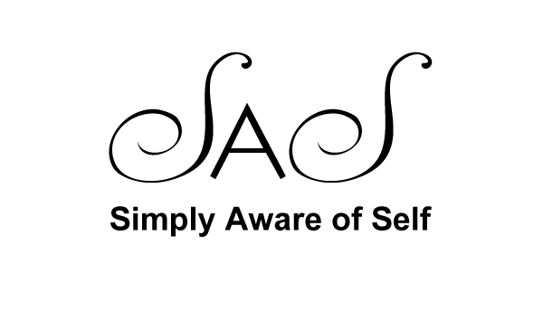
Original SAS Logo

I worked on fixing the design issues I mentioned before, and hand lettered the acronym to look like a whole, united acronym logo. Here is what I came up with:
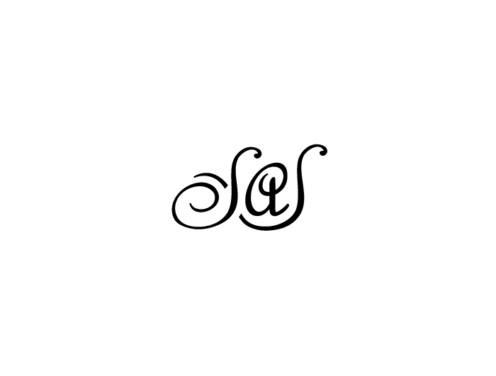
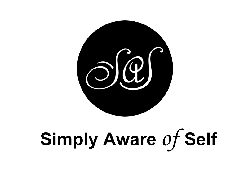
SAS logo makeover

SAS Logo makeover

This version is contemporary but classic from a design perspective, and creates a true visual mark from the letters SAS, which now flow together to represent connection and unity. The letters are enclosed in a circle in the full signature to represent completeness, awareness, and being centered.
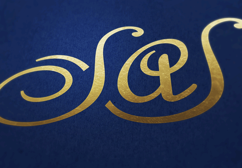
 

SAS Logo Makeover


I also helped SAS set up graphics for social media profiles. There was a signature graphic used throughout the branding prior to this, and I worked to re-size it and optimize the format for social media use.
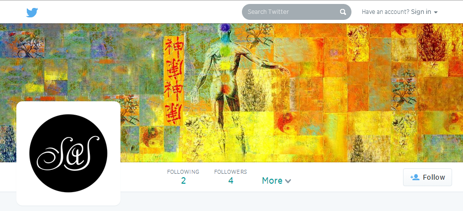
 

SAS Social media graphics


Have you tried to create a logo but found that it’s not quite hitting the mark just yet? Contact me to see how I can help you just like I helped SAS!


Related Posts

  • Brand development for international coffee brand: Bourbon Coffee
  • Logo Makeover for a Spirited and Hand-Crafted Brand: The Red Bandana Bakery in Bethesda, MD
  • Brand Identity and Marketing Collateral Design for To My Door DC (A Door-to-Door Drycleaning Company)
  • How can you make your business look professional?
  • A Special Sign for A Bridal Shower

Want me to put my skills to use for your project?

Send me a few words about how I could help you out—or just say hello.


    Your Name (required)

    Your Email (required)

    Subject

    Your Message

    Help me combat robot spam and prove you're a human with some simple math! What's 11+29? (required)

    I can also be found on Dribbble, Facebook and Twitter.

    2LCH is the graphic design, branding, and web development practice of Anna Tulchinskaya. It’s pronounced /Tulch/, just like the first five letters of Anna’s last name.

    Enjoy some more posts!

    Strategy in Graphic Design: Analyzing the industry with Porter's Five Forces

    Strategy and Porter’s Five Forces: Analyzing the Graphic Design Industry

    Michael Porter’s Five Forces framework is an analysis tool used to understand key competitive forces that affect an industry’s overall performance. The Five Forces are Threat to Entry, Threat of Substitutes, Bargaining Power of Buyers, Bargaining Power of Suppliers, and Intensity of Rivalry. As a small business owner, I often think about the strategy behind… [Continue Reading]

    Introduction to Reversal Theory and working as a way of caring for someone

    Apologies in advance for the length of this post: I’m beginning a new writing habit thanks to the wonderful Deborah of Radiant Media Labs, and I naturally tend to be wordy. And I use a ton of jargon while speaking. I’ll learn to be more concise as I write more. (Side note: I designed the… [Continue Reading]

    2lch ModelCo Lip Gloss

    ModelCo Lip Gloss

    Not sure if I’ll ever find this actually useful, but I’m so happy to see a lip gloss tube that has a mirror built into it. All companies should attempt to eliminate users’ pain points while using a product.

    Tips for graduates || 2lch

    Have a good meeting.

    How can you challenge yourself to make a tiny improvement to a routine task? While sitting in a meeting last week, I realized that the way people took notes sharply impacted their ability to implement meaningful change after a meeting. That made me wonder if making changes to the note-taking environment (i.e., the paper you… [Continue Reading]

    bloom! by 2lch

    Bloom!

    I’m pretty excited about this tiny little project I put together yesterday. It’s… bloom! I’m inspired by the Quantified Self movement and truly believe that self-tracking is a key habit, one that necessarily leads to positive behavior change and overall well-being. For the last few months, I’ve been looking for a starter self-tracking project that… [Continue Reading]

    Recent posts

    • Animation Assets for Advocacy with LAI Video
    • Empowering transportation through data: Transit Labs
    • Brand development for international coffee brand: Bourbon Coffee
    • Marketing website for tax advisers: RushTaxes
    • Logo Makeover for a Spirited and Hand-Crafted Brand: The Red Bandana Bakery in Bethesda, MD

    What is 2LCH?

    2LCH is the professional practice of Anna Tulchinskaya. Anna is a graphic designer and web developer servicing Northern Virginia (Arlington and Alexandria), Montgomery County, Maryland, and Washington, DC.
    • Dribbble
    • Facebook
    • Instagram
    • LinkedIn
    • Twitter
    • YouTube
    • About

    © 2025 · Anna Tulchinskaya · ALl rights reserved