• Skip to primary navigation
  • Skip to main content
  • Skip to primary sidebar
  • Skip to footer

2LCH

A world of purposeful work. ¡Que milagro!

  • Work

Herbal Essences is silly

image

image

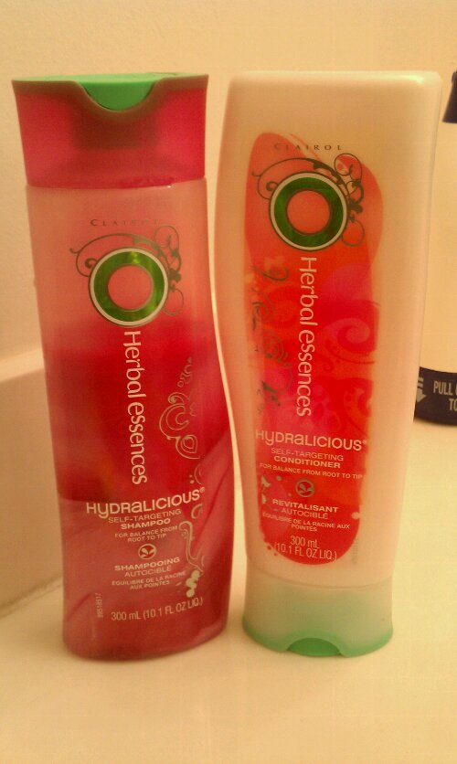
When I first saw these on the shelves, I was a little shocked. I still am. Why is Herbal Essences channeling “preteen sunscreen” in their packaging? Where is the “herbal essence”?

I have this weird nostalgia about this brand being my grandma’s favorite shampoo back in the ’90s, and I think she was sold on the original packaging, the one with the herb decals showing through the honey-colored shampoo. Even when I was 9 years old, I was sold on it too. So was my mom, who bought it pretty regularly. It was so great, why in the world would they replace it with artificial coloring, cheesy Illustrator brush swirl, and this weird shiny emblem? What happened to the brand?

I wish I knew what they were thinking. It’s like they outsourced their marketing department to a freshman business class in some average state school. Harsh, I know.

What really kills me is their apparent attempt at cross-selling the shampoo and conditioner. They’re trying to get you interested in a complementary product with a trivia question, what is this! As you’ll see in the picture, the shampoo has a trivia-type question aimed at the 18-24 female crowd. You’re supposed to find the answer on the conditioner bottle, and vice versa.

Who in their right mind would actually care??

They’re lucky the shampoo works well for my hair type at the price point I don’t mind. But still, what are they thinking?

And that, ladies and gentlemen, is why Herbal Essences is just silly.

Related Posts

  • Brand development for international coffee brand: Bourbon Coffee
  • Brand Identity and Marketing Collateral Design for To My Door DC (A Door-to-Door Drycleaning Company)
  • Creating a Unique Look with Digital Painting: Tom Kielty’s “…Cuz I Had To” CD Cover
  • Designing a website for an author: josephgrammer.com
  • Designing a book cover: COCOON KIDS by Joseph Grammer

Want me to put my skills to use for your project?

Send me a few words about how I could help you out—or just say hello.


    Your Name (required)

    Your Email (required)

    Subject

    Your Message

    Help me combat robot spam and prove you're a human with some simple math! What's 11+29? (required)

    I can also be found on Dribbble, Facebook and Twitter.

    2LCH is the graphic design, branding, and web development practice of Anna Tulchinskaya. It’s pronounced /Tulch/, just like the first five letters of Anna’s last name.

    Enjoy some more posts!

    Not Allowed || 2lch

    Do not greedily poeticize

    I don't like you || 2lch

    Conversations I could be having in real life

    Different typefaces (?), same cigarettes (?).

    From an ’83 Nat Geo

    I love the Ad Council.

    8 || 2lch

    Hello, LetterCult!

    As I previously mentioned, I’m trying to get my type skills in order. I know that practice is the only way to get good at something, so I’m forcing discipline through submissions to compilations such as the Alphabattle on LetterCult. Today they posted my first submission! The idea is that participants submit interpretations of a… [Continue Reading]

    Recent posts

    • Animation Assets for Advocacy with LAI Video
    • Empowering transportation through data: Transit Labs
    • Brand development for international coffee brand: Bourbon Coffee
    • Marketing website for tax advisers: RushTaxes
    • Logo Makeover for a Spirited and Hand-Crafted Brand: The Red Bandana Bakery in Bethesda, MD

    What is 2LCH?

    2LCH is the professional practice of Anna Tulchinskaya. Anna is a graphic designer and web developer servicing Northern Virginia (Arlington and Alexandria), Montgomery County, Maryland, and Washington, DC.
    • Dribbble
    • Facebook
    • Instagram
    • LinkedIn
    • Twitter
    • YouTube
    • About

    © 2025 · Anna Tulchinskaya · ALl rights reserved