Not too long ago, Aleks Jakulin of publishing startup Ganxy alerted me of a really great initiative. Recovering the Classics is a project organized by The Creative Action Network to crowdsource fresh new looks for beloved books (Zing! You guys need a new slogan?), in order to reignite interest in classic literature. Obviously, I signed up right away. I basically want to read books and design for them all day every day, and I loved the opportunity to work on one of my favorite pieces of lit—Tolstoy’s Anna Karenina.
Since this isn’t a client-based project (i.e., I can be as open as I want with sketches), I thought I’d use this opportunity to show a bit of my process. Keep in mind that I was my own art director and client in this case, so this is a rather condensed process compared to a “regular” project.
Exploration
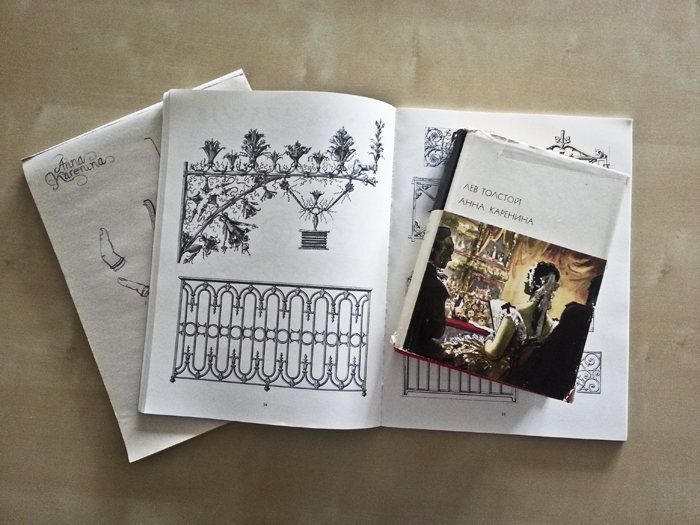
Like I said, I love Anna Karenina, so I had already spent quite a lot of time thinking about the grand themes and undertones of the book. To prepare, I isolated a few I felt really strongly about.
The key symbols and themes I decided to work with included: railway imagery/tracks, fences, being torn between duty and desire, finding one’s way, and breaking points/ripping.
I spent some time looking at reference materials for wrought iron fences and rails, consulting my copy of the novel, and sketching out some images/patterns.
Sketches
1: Torn edges, period patterns, railway tracks
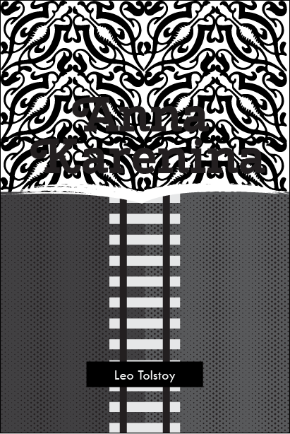
This is what very, very first drafts look like on my end. This took no time at all, and was simply meant to get something, anything, down for quick evaluation and iteration. In this concept, I wanted to test a layout where the top third or so would look like a wallpaper pattern with wrought iron fence motifs, and I was considering hand-lettering the title of the novel to blend into this pattern. The bottom would be a two-tone field (to represent conflict between choices), with a railway binding the two color areas together like stitching. This “field” would have a torn edge at the end, as if someone had ripped off the continuous tracks and revealed Anna Karenina.
I was really excited about this idea when I first started thinking about it, but a minute into working on this layout I realized that it may be a little too convoluted for my tastes. So I tried something else.
2. Railway tracks, pattern, fence/chain motif
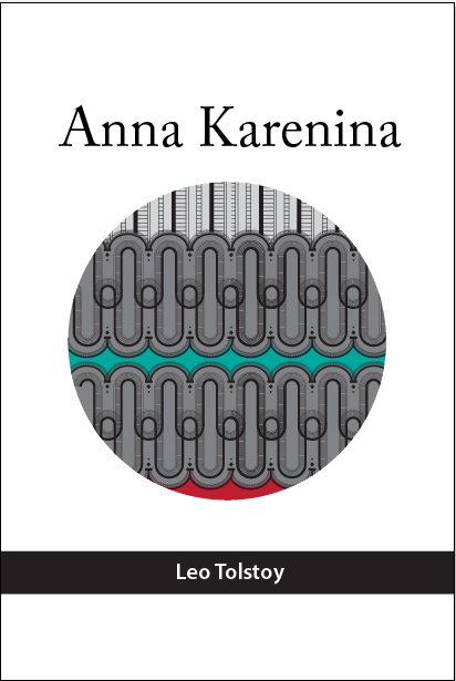
Using my wrought iron reference book, I started sketching different patterns and motifs, making custom brushes in Illustrator, until I developed what looks like a fence and chain of railroad tracks. I added some high-tension colors to set the mood, and explored a layout that would focus the eye on the pattern, doing minimal work when it came to thinking about the typefaces I want to use. I liked the pattern and my default go-to Caslon typeface for the title, but I was worried that I wasn’t pushing the envelope far enough. A railroad-inspired pattern is fun, but is this execution of it something that would make a potential reader pick up this book at the bookstore?
3. Split, typogram
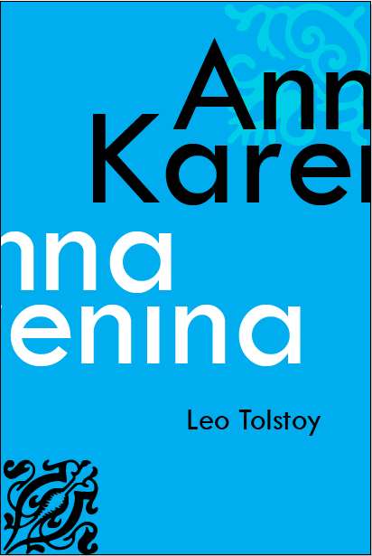
Few things make me happier than seeing other designers do something very clever and very minimal at the same time. In a desperate attempt to do that myself, I thought of doing a typogram for the cover. A major theme I was exploring was the lack of congruence between what one wants to do and needs to do, so I split the title in half, and made it run off of opposite sides of the page. I attempted to create a symbolic pull in different directions. I wasn’t too worried about readability. After all, the book is a classic, and it’s still rather easy to recognize the title even if you can’t read it easily. However, once again, I thought that this wasn’t doing a great job of making the book seem desirable for a new crowd.
Final concepts and execution
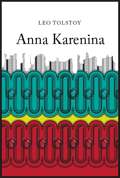
In the end, I finalized two executions of the cover. One was a version of that railroad track pattern I started earlier. I refined it and added detail, and made it dominate the layout. Patterns are inherently interesting to the human eye, so I guessed that a dense, high-contrast, pattern-driven graphic might make the cover enticing enough visually for someone to pick it out on a bookshelf. To add to the concept, I set the author’s name and title on a white field of what looks like dripping paint (or maybe the shape is really dripping blood? Spoilers!). It’s as if Anna Karenina is painting over the patterns of her prior life, and trying to start with a clean slate.
The second execution happened on a whim. I decided to do something way outside of what someone would expect from an Anna Karenina cover. As it happens, it also ended up being more true to my personal style. The novel is in large part about passion and the severing of ties to one’s duties. What better way to represent that than with a severed ring finger?
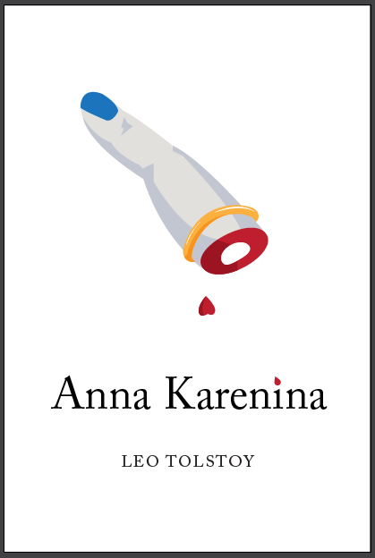
If you’ve read the book, perhaps you know that this is one of the more literal ways to look at designing a cover for Anna Karenina. It’s my personal favorite, as I know that I would not be able to keep myself from picking up this version at a bookstore if I saw it.
I had a blast working on these. What’s next? Perhaps I’ll tackle another favorite of mine—The Count of Monte Cristo. After all, I already have a concept in mind.
Are you an author or a publisher?
I’d love to help you out! Please contact me if you’d like to work together on a book cover or another publishing design project.