![]()
The Red Bandana Bakery is awesome—the goods are delicious, the owner is spirited, and there’s a lot of love and care that goes into every single detail. We worked together to refine the owner’s original logo concept in order to make the various versions of the logo display better across various media, including the storefront, packaging, merchandise, and online marketing.
The original logo was already very strong. It had a clear concept, typographic choices that were appropriate for the brand attributes communicated in the customer experience, and used a confident and recognizable color scheme. Basically, the original nailed the elements that make up the foundation of a strong brand identity. The logo makeover process kept building on those choices, and focused on details beyond the foundation, such as legibility and the shape of the composition.
Branding Lesson
Don’t be afraid to DIY your logo at first and refine your ideas before consulting a professional. You can always begin to build an audience with what you have, and then reach out to a brand identity pro to visually refine the logo you’ve made. Your brand identity is always going to be a work in progress. It doesn’t have to be perfect from day one.
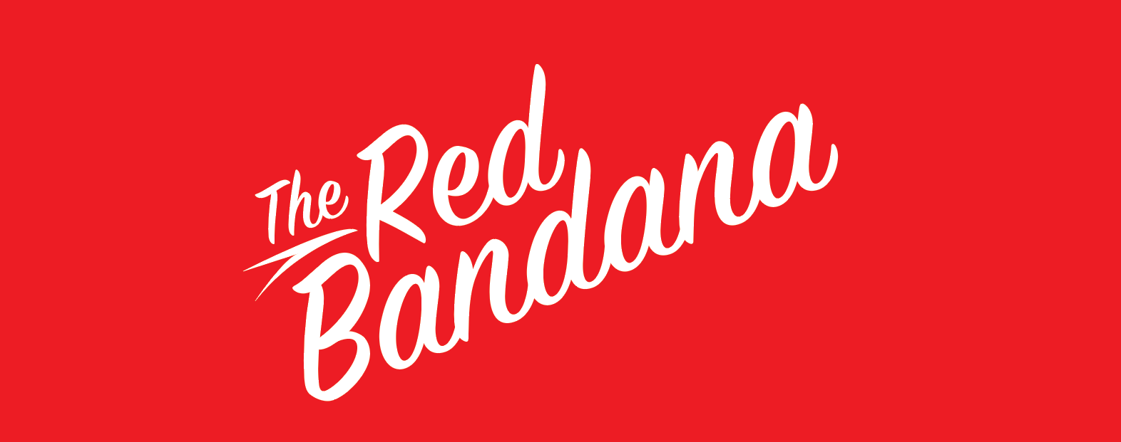
First order of business was modifying the arrangement of the various elements of the signature—the brandmark (the bandana illustration), the wordmark (“The Red Bandana”), and the tagline (“A Happy Healthy Little Bakery!”)
When doing so, it’s important to determine the order of importance for all the elements. That is, what should people be most likely to remember after being exposed to the logo? In this case, the most important element were the words “Red Bandana.” If a customer remembers nothing else except the words “red bandana,” they would be able to successfully search for the business and tell their friends about it. In the original logo, these words were visually competing with the brandmark, and separated a smaller “the red” from “bandana,” which would make “bandana” alone the more memorable element. In the updated logo, “red bandana” stands out as the strongest element in the hierarchy.
Branding Lesson
Pay attention to what is most memorable about your logo, and what stands out the most. Does it make sense strategically?
![]()
Branding Lesson
Make sure to also develop a standalone wordmark, without any other elements (i.e., the brandmark and the tagline). Your logo should be recognizable and strong in this format as well.
The second noteworthy element of this makeover is work on the shape of the logo. Notice that when placed in a perfect geometric shape (a circle in this case, although squares might work best for other logos), the original logo didn’t look like it was comfortably fitting into the space:
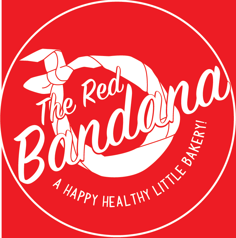
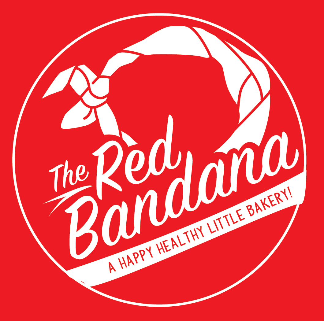
The updated logo fills out a circle much more nicely, which is more pleasing to the eye and ensures that it’s easier to use this logo in different layouts (e.g., in marketing materials, conference sponsor lists, etc.).
Branding Lesson
Your logo should nicely “fill” a perfect geometric shape, such as a square or a circle. Otherwise it might look strange to the eye or be difficult for graphic designers to use in various layouts.
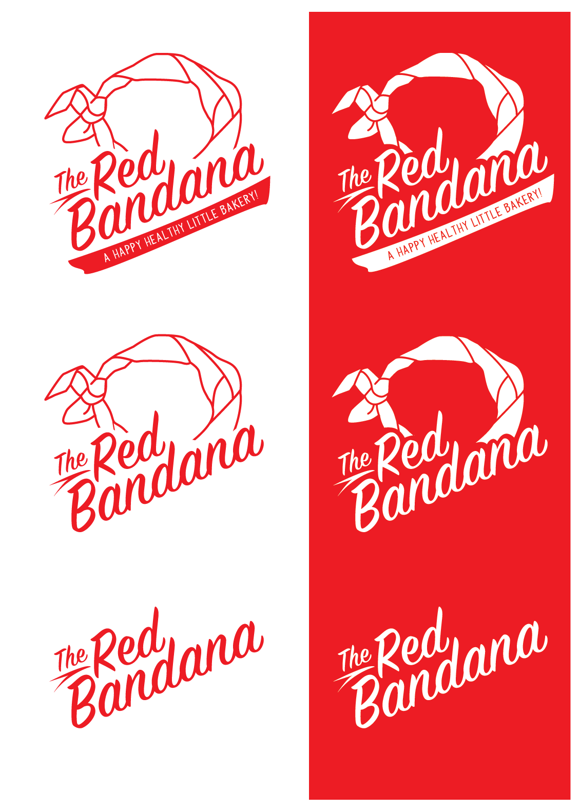
Here are all the variations of the updated logo. From top to bottom, you have the full signature, the wordmark + brandmark, and the wordmark alone.
How do you know if a logo update process worked? It looks great in all the different ways the business ends up using it! Explore some of the applications below.
![]()
![]()
![]()
![]()
![]()