• Skip to primary navigation
  • Skip to main content
  • Skip to primary sidebar
  • Skip to footer

2LCH

A world of purposeful work. ¡Que milagro!

  • Work

Brand Identity and Marketing Collateral Design for To My Door DC (A Door-to-Door Drycleaning Company)

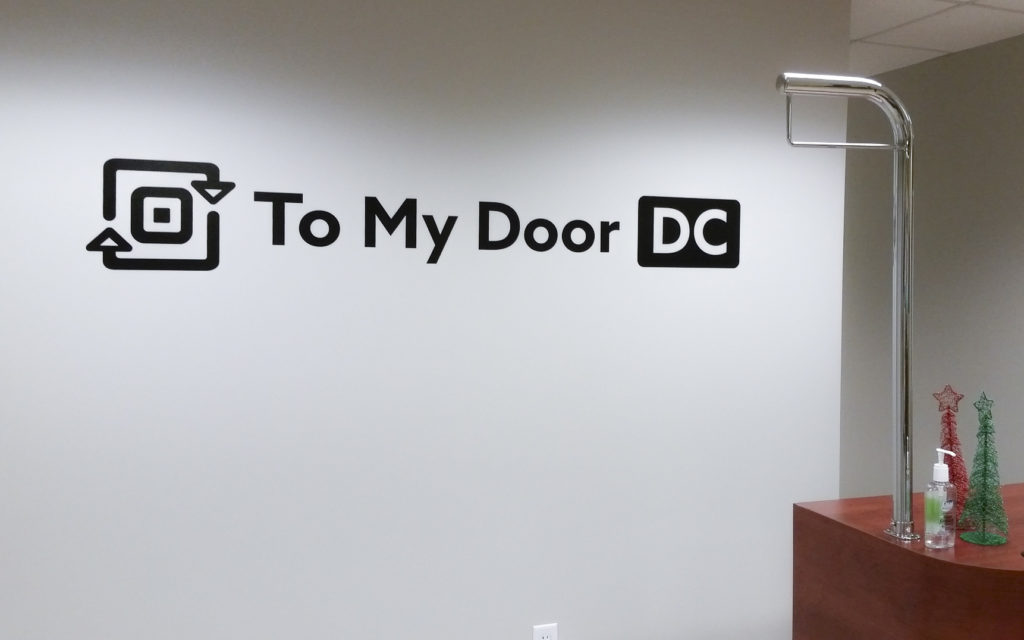
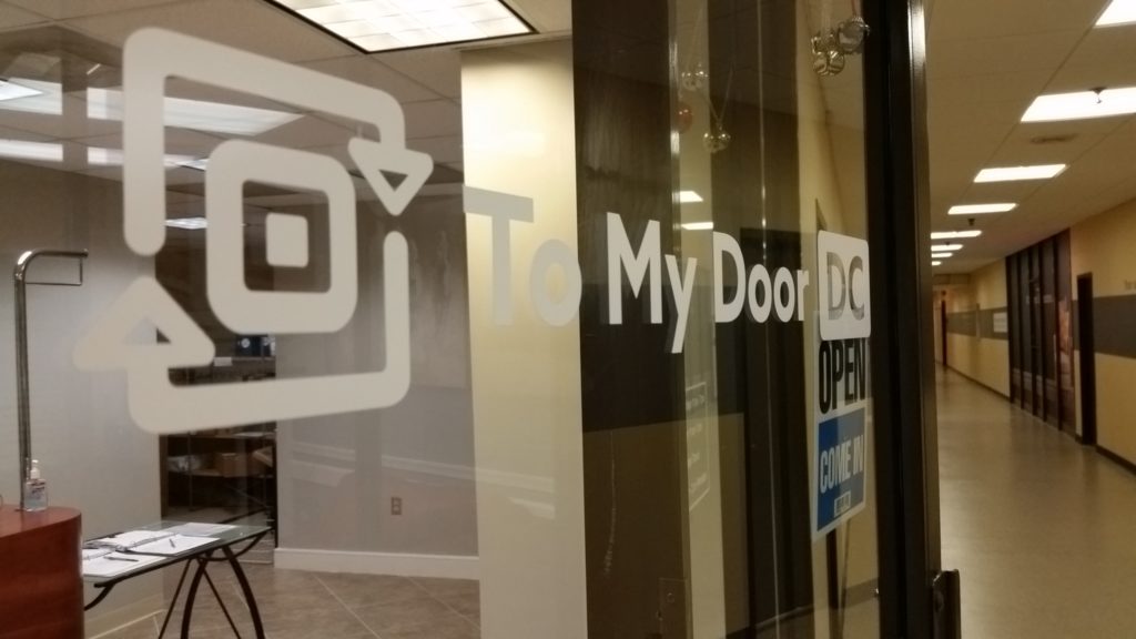
To My Door DC is a door-to-door drycleaning company in the Washington, DC area. We worked together to create a brand identity and marketing materials that would properly communicate the company’s innovative approach and quick, efficient, and friendly service.

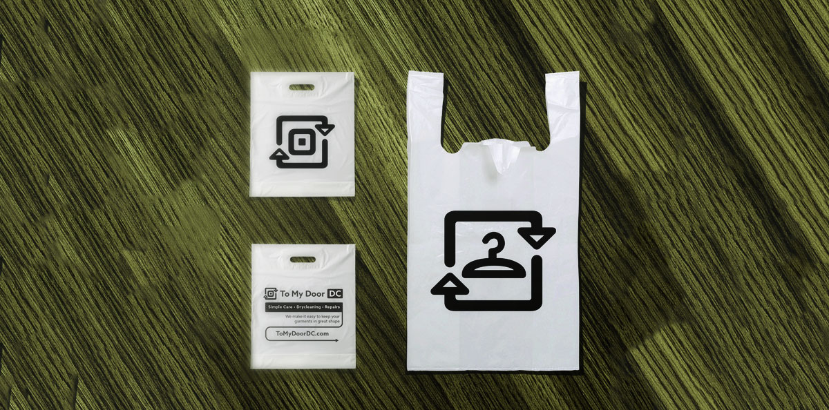
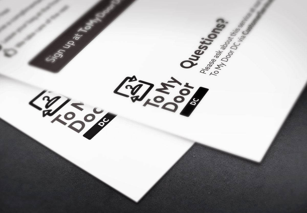
This brandmark visually represents two concepts: seamless pickup and delivery that makes up the core of the service, and the idea that To My Door DC makes dry cleaning “easy as pressing a button.” We maintained a clean black-and-white scheme and chose a thick-stroked, sans serif font in order to continuously reinforce the friendly and innovative tone of the brand.


Branding lesson

Typically, thicker lines and an emphasis on round shapes and curved corners helps create the sense that the brand will provide a friendly and simple experience. In addition, bold lines, a simple color scheme, and sticking to “perfect” shapes such as squares and circles communicates the brand attributes “simple” and “reliable.”


Related Posts

  • Brand development for international coffee brand: Bourbon Coffee
  • Logo Makeover for a Spirited and Hand-Crafted Brand: The Red Bandana Bakery in Bethesda, MD
  • Creating a Unique Look with Digital Painting: Tom Kielty’s “…Cuz I Had To” CD Cover
  • Acronym logo makeover: SAS Acupuncture
  • Designing a website for an author: josephgrammer.com

Want me to put my skills to use for your project?

Send me a few words about how I could help you out—or just say hello.


    Your Name (required)

    Your Email (required)

    Subject

    Your Message

    Help me combat robot spam and prove you're a human with some simple math! What's 11+29? (required)

    I can also be found on Dribbble, Facebook and Twitter.

    2LCH is the graphic design, branding, and web development practice of Anna Tulchinskaya. It’s pronounced /Tulch/, just like the first five letters of Anna’s last name.

    Enjoy some more posts!

    Global migration patterns || 2lch

    Infographic: Global migration trends, a work in 3D (2010)

    In 2010, I was part of Sticks + Stones, an international design collaboration between universities in the United States, China, Germany, and Turkey. We put together an exhibit in Berlin that invited visitors to contemplate the roles of stereotyping, migration, and immigration in their lives. One of the projects I contributed is a 3D infographic… [Continue Reading]

    Sell Art Without Selling Out || 2lch

    Sell Art Online Without Selling Out: 4 lessons learned from Lewis Howes’s creativeLIVE workshop, and how to apply them as an artist

    In early December, Chase Jarvis’s (@chasejarvis) and Craig Swanson’s (@craigmswanson) brainchild creativeLIVE (@creativeLIVE) ran a seminar on online businesses hosted by former pro athlete and entrepreneur Lewis Howes (@LewisHowes), with guest appearances by Derek Halpern (@derekhalpern), James Wedmore (@jameswedmore), and Amy Porterfield (@AmyPorterfield). The workshop did a great job covering the basics—it featured discrete lessons… [Continue Reading]

    Public enemy no. 2.

    Aw. Notice the delicate balance of priority between the dog poop story and the Turkish earthquake story.

    Castaway Farm logo || 2lch

    Castaway Farm identity

    Castaway Farm in Jackson, New Jersey, needed a logo that communicated the owner’s personality and allowed the company to stand out among specialty breeders. The final art-nouveau-inspired brand identity was both fun and appropriate as a breeder’s seal. The floral elements visible in the logo are continued throughout branded material, such as titles of various… [Continue Reading]

    Marketing Research Colloquium Logo || 2lch

    Aloha, notebooks

    These aren’t pretty pictures, but some of the collateral that I’ve designed for an upcoming conference arrived today. Thought I’d share. It’s nice to help out my alma mater. With this one, I had fun playing with a letterform-driven logo solution that represents the unlocking of ideas. Hence the keyhole imagery and a quirky (and… [Continue Reading]

    Recent posts

    • Animation Assets for Advocacy with LAI Video
    • Empowering transportation through data: Transit Labs
    • Brand development for international coffee brand: Bourbon Coffee
    • Marketing website for tax advisers: RushTaxes
    • Logo Makeover for a Spirited and Hand-Crafted Brand: The Red Bandana Bakery in Bethesda, MD

    What is 2LCH?

    2LCH is the professional practice of Anna Tulchinskaya. Anna is a graphic designer and web developer servicing Northern Virginia (Arlington and Alexandria), Montgomery County, Maryland, and Washington, DC.
    • Dribbble
    • Facebook
    • Instagram
    • LinkedIn
    • Twitter
    • YouTube
    • About

    © 2026 · Anna Tulchinskaya · ALl rights reserved